

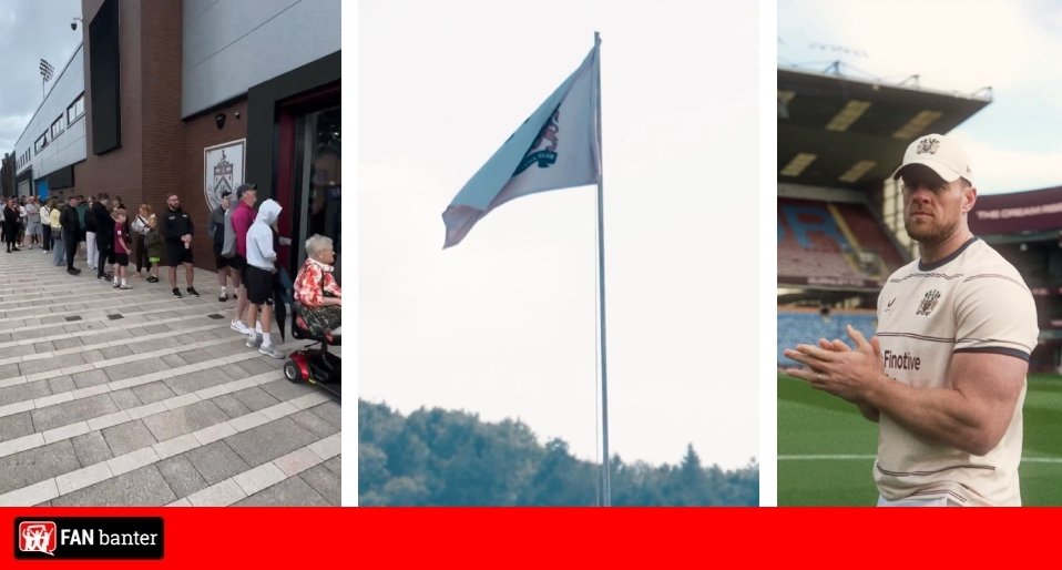
Fans plea for Burnley to permanently change to a beloved old crest as a reworked version emerges for their new away kit.
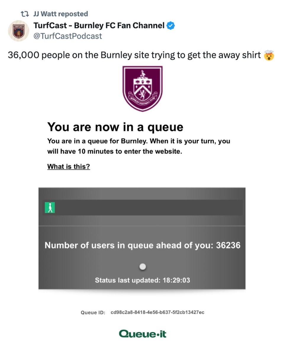
Club co-owner JJ Watt has spent two years coming up with this new strip, and fair to say it was time well spent, with over 30,000 immediately in the queue to purchase online, plus many others outside the club shop as it’s released.
Burnley’s crest which has been used since 2009, and then the one updated in June 2023, was a big change which has always caused a stir since.
And after feedback from the fanbase, a reworked version of the badge used in the 1979/83 and 1987/2009 season has been used, with supporters now wanting it back on a permanent basis.
#NewProfilePicture pic.twitter.com/vAye1hZM6j
— Burnley FC (@BurnleyOfficial) July 31, 2026
The club said in a statement on their website: “Burnley Football Club is proud to unveil its new 2026/27 away kit, a project nearly two years in the making and led from start to finish by club co-owner and NFL great JJ Watt.
“Working closely with both the club and technical partner Castore through every stage of the creative process, Watt played a hands-on role in developing a shirt that celebrates Burnley’s identity, heritage and supporters. From the choice of crest and colour palette to the finer design details, he led the project from concept to completion. The result is a striking cream shirt, paired with claret shorts and cream socks, inspired by the town, its history and the people who call it home.
“At the heart of the design is a return of one of the club’s most beloved crests, worn between 1979–83 and again from 1987–2009. Following countless conversations with supporters over the past two years, Watt was determined to bring back the iconic shield that holds a special place in the hearts of generations of Clarets fans. The crest has been thoughtfully reworked in a tonal palette to complement the away kit, retaining the character of the original while creating a look that feels both timeless and distinctly Burnley.
“The shirt also features a bespoke pattern inspired by the distinctive stonework of Gawthorpe Hall, home to Burnley FC’s training ground. The historic estate has been intertwined with the club for decades, with its medieval barn serving as the location for this season’s player photoshoot. The barn itself holds a unique place in Burnley’s history, having been used as the club’s gymnasium during the 1950s when Gawthorpe formed part of what was one of the earliest dedicated training facilities in world football.
“The attention to detail extends inside the neckline, where the shirt features a bespoke wordmark inspired by the typography found on Burnley matchday programmes from the 1960s and 70s.
“Another subtle nod to the club’s rich history, the vintage lettering has been carefully reimagined for the modern era, ensuring even the smallest design details reflect the heritage and identity at the heart of the shirt.
“The finishing touch comes just beneath the rear collar, where an ‘1882’ script celebrates the year of Burnley Football Club’s foundation.
“Launching alongside the new kit is a cinematic campaign film that showcases the best of Burnley and the surrounding countryside and villages, starring JJ Watt in a playful nod to one of his NFL nicknames – “The Milkman”.
“The film follows Watt as he drives a traditional milk float through the iconic Lancashire countryside and into Burnley, delivering “the cream” to the town.
“Along the way he visits Burnley supporters and famous faces including cricketing icon Sir Jimmy Anderson, Capital Radio DJ Jordan North, Bank of Dave founder Dave Fishwick and Burnley legend Stan Ternent, while also passing local landmarks including the Singing Ringing Tree and the Royal Dyche, whose landlady, Justine Lorriman, also appears in the film, before arriving at Turf Moor.
Speaking about the new away kit, JJ Watt said: “From day one, I didn’t want this to be just another football shirt.
“I wanted to create something quintessentially Burnley. Every decision we made started with one question: are we doing the supporters of this club proud?
“As I’ve said many times before, this club existed long before I arrived and it will exist long after I’m gone.
“But during this time, my goal is to help honour its great past while also shepherding it to a brighter future.
“Bringing back this iconic crest was extremely important to me, mainly because of how much it means to our supporters, but also because I’m just a massive fan of it.
“This shirt belongs to the people of Burnley, and I hope they can see how much care and thought has gone into every single detail.
“I’m incredibly proud of what we’ve created together, and I hope it will be worn with pride for many years to come.”
Speaking on the collaboration, Castore Co-Founder and CEO Tom Beahon said: “In all my years working in elite sport, I’ve never known an owner become so immersed in the design process.
“JJ challenged every decision, listened intently to supporters and cared deeply about getting every detail right.
“Our team worked incredibly closely with him and Burnley over nearly two years, and we’re proud to have brought his vision to life while delivering a kit that met the exacting brief JJ and the club set out from day one.
“It’s a shirt that tells a genuine story about Burnley, and that’s what makes it so special.”
Fans plea for Burnley to permanently change to beloved old crest as a reworked version emerges…
@chasbfcdarts: Hopefully the positive reaction to this makes ALK realise how unpopular the monochrome badge is and this comes back as our permanent badge next season
@TurfCastPodcast: There’s just something about that crest
@Ted_drewett: Genuinely think this badge is one of the best out there in football. Chuck this on any Burnley kit and it would make it at least an 8/10 and I’d be buying it. Please make it permanent #twitterclarets @AlanPaceBFC @JJWatt
@ClaretXtra: Goodness me. It just looks right, doesn’t it? #TwitterClarets
@_KyleRC_: Best redesign in club football? That’s actually incredible
@okStevieee: Move back to this badge full time
@lashworth1991: Its about time. We changed in 09 to celebrate being back in the PL. No one wanted the change, no one asked for it to just never go back, not 1 fan wanted us to stick with the old (current) badge but they left it anyway. Time to fully change back to this absolute beaut
@Zoot_Sax: So so so happy the old badge is back. Means so much, I got a little bit emotional at seeing it and also seeing Stan in the launch video. Well done and thank you @JJWatt #twitterclarets
@OfficialVizeh: Oh you have no idea how happy a simple badge change had made me. The True Burnley Football Club
@TurfMoorClarets: We need to go back to this badge! And sack the other one off #twitterclarets
@AlfieYounger16: Just change the badge back to this
@BFCTurf: @AlanPaceBFC Keep this badge. JJ is onto something
@chasbfcdarts: It’s just the best badge ever isn’t it
@darealcapybara: Fuck minimalism. Badges like these need a resurgence.
Seeing that badge back,makes me realise how fucking shite this looks ….. https://t.co/1jr7ylrGdH pic.twitter.com/9fCpfmi33J
— cammy mozza (@cammy_mozza) August 1, 2026

